The visuals that tell the Covid-19 story
6 individual ways of seeing data from the pandemic.
Covid-19
Healthcare

A great graphic often communicates much more powerfully than words can. There’s an immediacy and a simplicity that really helps people understand what you’re trying to get across, and to remember it too. When that message is about staying safe and saving lives, it reminds you why good visuals can be really important.
Check out our selection of visuals below. Thank you to whoever designed them for playing your part. It’s easy to forget how ideas like social distancing were barely understood a couple of months ago but are now ingrained. You have helped make people think and actually change their behaviour.
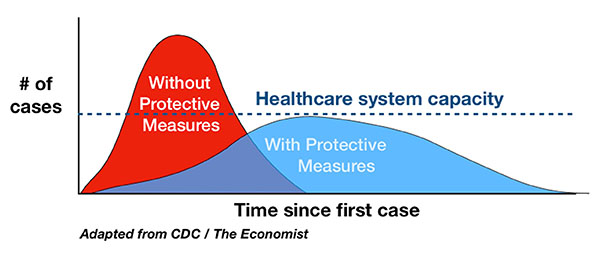
The flatten the curve graph is now etched in many people’s minds. The concept is part of everyday language and even has its own Wikipedia page!
There are various versions of this graph, but the message is the same – to show how reducing the peak numbers needing care can help ensure the healthcare system isn’t overwhelmed. Simple but effective.
See more about the visual here.
This GIF from the Australian government shows how small individual changes in behaviour can affect the spread of the disease.
Your actions will save lives. This is why it’s important to stay home: pic.twitter.com/Xw1igJwPi3
— Australian Department of Health and Aged Care (@healthgovau) March 25, 2020
This is another great animation from a Spanish designer and shows the value of breaking the chain to stop the disease spreading in an emotive way.
This clever animation simulates how fast the virus spreads with and without social distancing. The dots represent people moving and spreading infection.
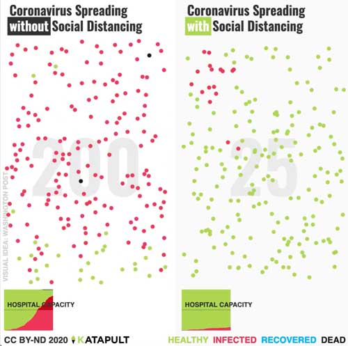
See more about the visual here.
Like other visuals above, this infographic highlights how individual changes in behaviour can have a big impact in terms of the number of infections. Variants of this graphic have been shared by universities, public bodies and media outlets in the US and UK, probably because it hits home the message well.
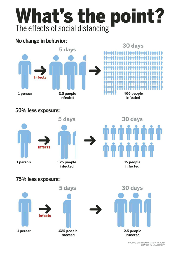
See more about the visual here.
This is another type of graph that has become familiar to those of us in the UK from government briefings during the pandemic, and from newspapers’ data visualisation teams, such as @ftdata. It shows the growth of the outbreak in different countries. This version is from Information is Beautiful. It is interactive and allows you to view lots of information at once and still make sense of it.
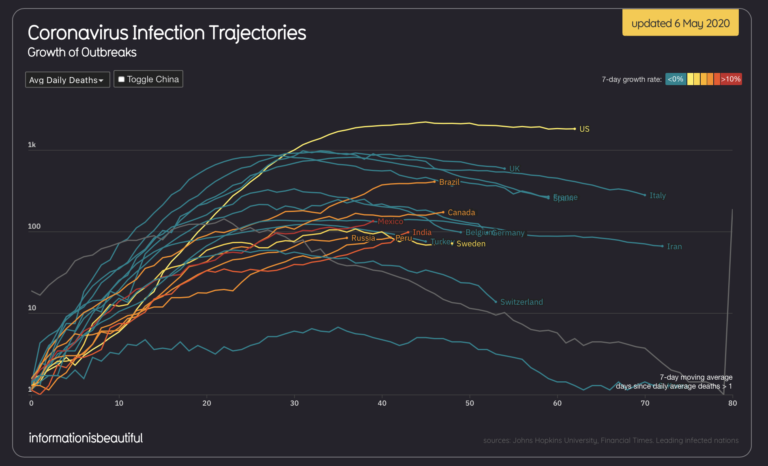
See this visualisation explored properly here.
We use a whole range of virtual collaboration tools and methods in our own design thinking training to help people communicate their ideas visually and engage others. Using these simple visual tools and methods can help you explore options, organise your thoughts and collaborate effectively, even while you’re working remotely. If you want to find out more, check out our online training courses here.
"*" indicates required fields