The edge of our competitive edge
Talking collaboration & design with the duo behind our new brand.
DK&A News
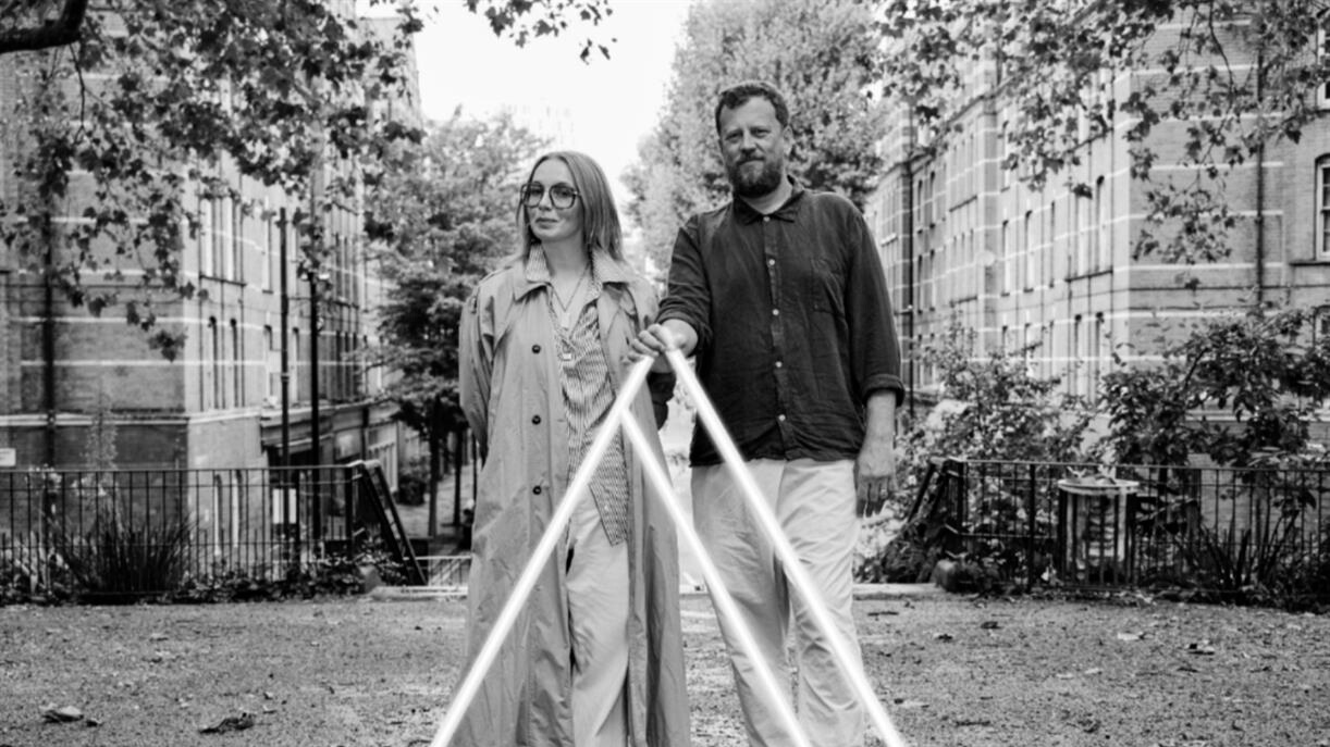
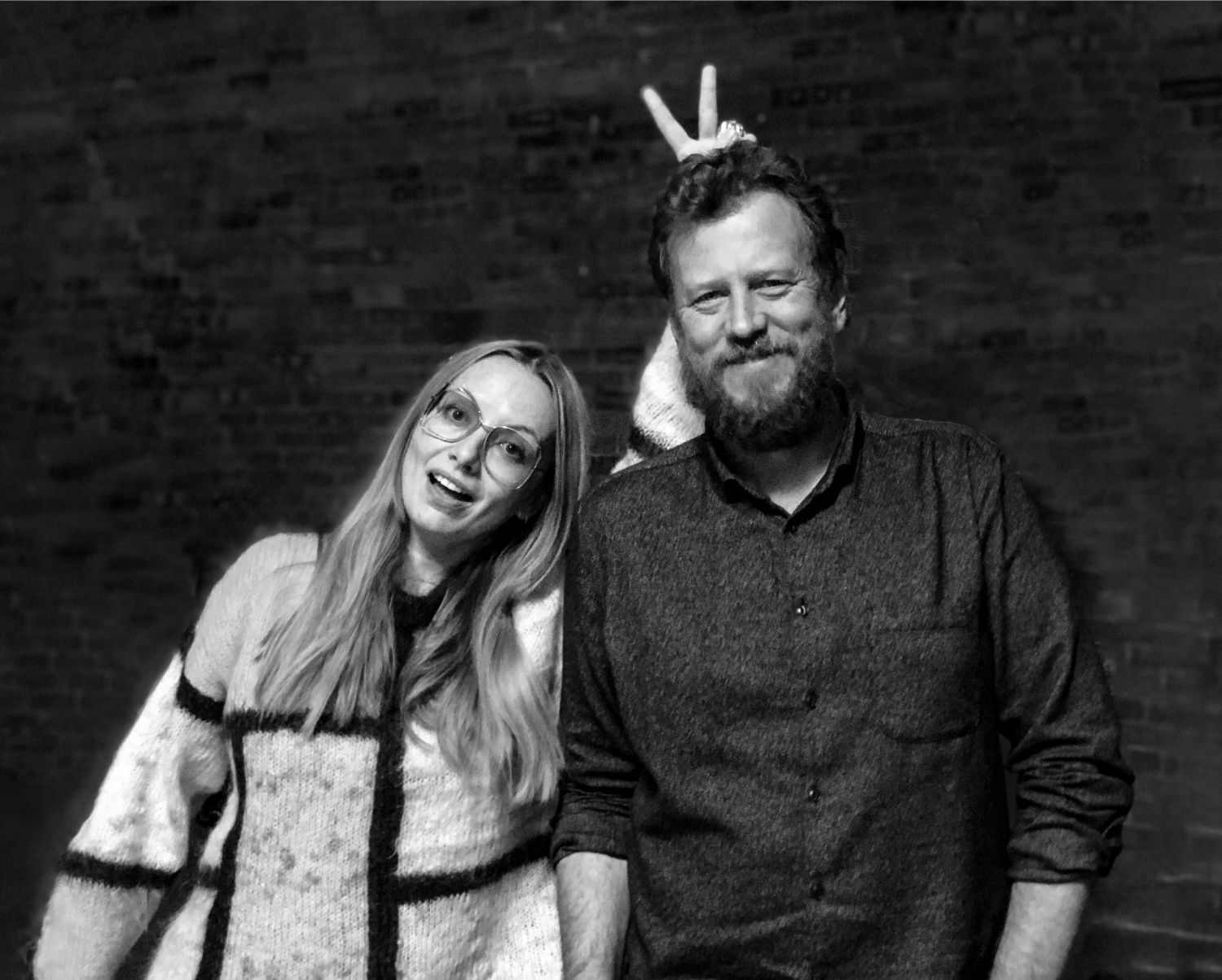
Ray and Dan are multi-award-winning creative directors with experience leading big teams and global ad agencies, including Wieden & Kennedy and more recently McCann London. They’ve worked as a creative duo (Ray being a Copywriter and Dan a Designer) for most of their careers. With this in mind, we wanted to gain an insight into how their creative marriage works and hear their reflections on collaborating with us at DK&A.
As a duo, collaboration means trusting one and other, even when they’re not completely aligned on what the best idea is. They each have their own individual strengths, which sometimes means following just one of their creative instincts at different points in a project and making the decision to win and fail together. According to Dan, if they were to draw a Venn diagram, there’d be a whole bunch of crossover between their skills, but there’d also be a number of outliers. He elaborates, “we’re stronger than the sum of our parts. Design is really powerful and important. However quite often design can look great, but the words don’t make you feel a thing. So to have the words that make you really feel something – plus strong design. That collaboration helps us to reach a point that you can’t get to on your own.”
They both agree that the key ingredient to collaboration is feeling comfortable enough with each other that they can be honest, without having to expend all of their energy managing feelings. This comes with time and can often come undone when working in larger teams. Ray says, “In order to navigate the chaos of the creative process, you have to be strong as a team. Whether that means laughing or crying together, you need the psychological safety to be able to say the stuff that you need to say.”
They feel lucky enough to have many standout projects that they could cite, but when they worked with mobile giant Three, Ray & Dan felt the pressure of a massive business imperative, following a 10-year decline in the company’s reputation. When they joined the account, they could see the potential to build on Three’s position as a network built for the internet. “Bear in mind this was a few year’s ago!” they caution, when there was a growing excitement around what the internet could do and mean, particularly with faster connections. The work that they and their team did together, along with ambitious and trusting clients, saw a three-fold customer acquisition over a three year period. It took a collaborative spirit to really get to a more compelling and emotional point of view around why we send each other LOL cats.
The duo believes that a key ingredient to every project is defining the brand’s unique point of view, which goes on to inform everything else. This is particularly important in today’s world, where people engage with brands across a multitude of different channels. The message needs to be consistent.
When Ray & Dan worked on Lurpak, they wanted to build on the brilliant work of their predecessors on the account, Ben Walker and Matt Gooden. They had already developed a compelling point of view ‘Good Food Deserves Lurpak’, pushing the product far beyond rational benefits of creaminess or spready-ness. When Ray & Dan took over, they could see though that the food conversation was changing, that the UK was becoming more food and cooking conscious and leapt on that. Dan says “the idea was that if you want put effort into cooking good food, then you should use a good ingredient because otherwise why bother? And then no matter what the food culture is, whether you’re talking about comfort food, fast food, midweek dinner, feeding kids, whatever it is, you’ve got this point of view at the heart.” They took that original brand thought and super-charged it by plugging in to cultural context.
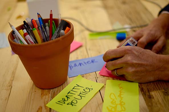
When Ray & Dan began working on the new DK&A brand, they asked us to throw all the materials we had at them – from project decks, reports and case studies to design thinking tools and online courses, to help them gain a rich understanding of who we are and what it is that we do. The first thing that struck them was the way that humanity shines through our work, despite the ‘mind-boggling’ complexity of the projects. They boiled down the ethos at the heart of our culture: the ability to bring people together and facilitate the sharing of thoughts, ideas and feelings.
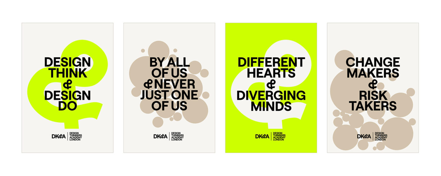
With this point of view in mind they designed a range of different brand directions with different brand touch points including posters. To gain our input, they ran a collaborative workshop with the whole DK&A team. The posters helped us to immediately engage with each brand concept, prompting plenty of lively discussion. After capturing our feedback they were able to steer the development of the final brand language, which combined different visual and linguistic devices to produce a new identity that represents our team spirit.
The new brand consists of a series on interplaying elements, each of which expresses a different aspect of this spirit. Ray notes, “the ampersand is a linguistic tool to communicate the concept of collaboration, while the molecule bubble is a visual element which captures that energy of a workshop and gives more personality and energy to the brand.” When you bring them together, we’re able to create something that embodies the sometimes contrasting aspects of the work that DK&A does.
The dichotomy between the serious, professional side of DK&A’s work and the change-maker, rebellious nature of our approach was something that Ray & Dan considered in detail when engineering the new brand’s colour palette. Having a muted, thoughtful colour palette gives the often-academic work more space to breathe, with the small splashes of acid green add a rebellious zag and energy.
After taking some time out from agency work to focus on other pursuits, Ray & Dan are about to enter a new chapter of their joint career with the creative agency Pablo. They’re looking forward to working with an extended team once again, and to get stuck into some challenging new projects. Dan concludes, “Pablo have real momentum and energy and they want people to be responsible for what they bring to the table. We love that because they really clear about it. There’s no having to work out what they’re about – they verbalise it in a way that we just got really excited about.”
Related posts
The evolution of design thinking
Who started Design Thinking? Clive Grinyer charts Design Thinking’s growth from a niche activity to a mainstream practice.
Sparking innovation: Ready, Set… I don’t know
Embracing the unknown can be daunting. But as Joe Ferry explains, it’s an essential part of innovation. He discusses his 3 key ingredients for success.
"*" indicates required fields